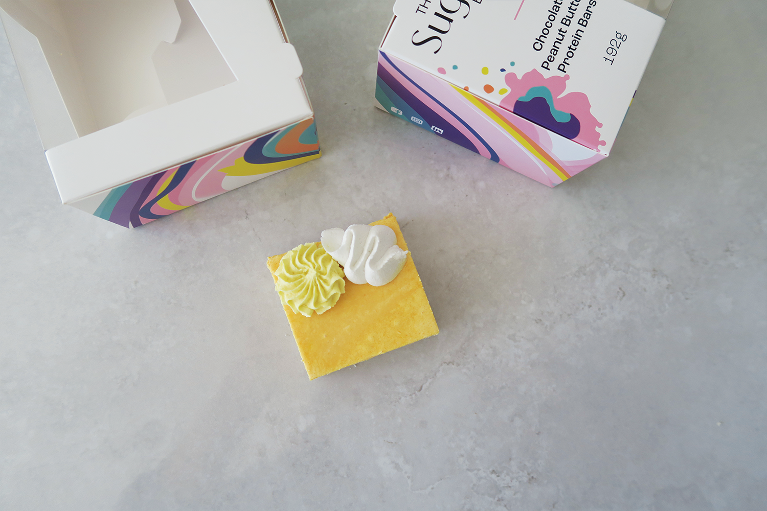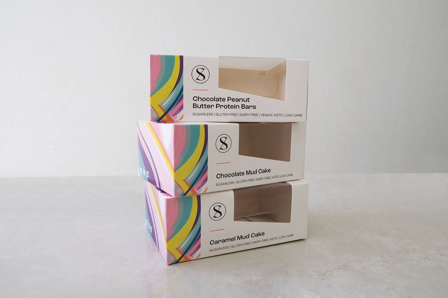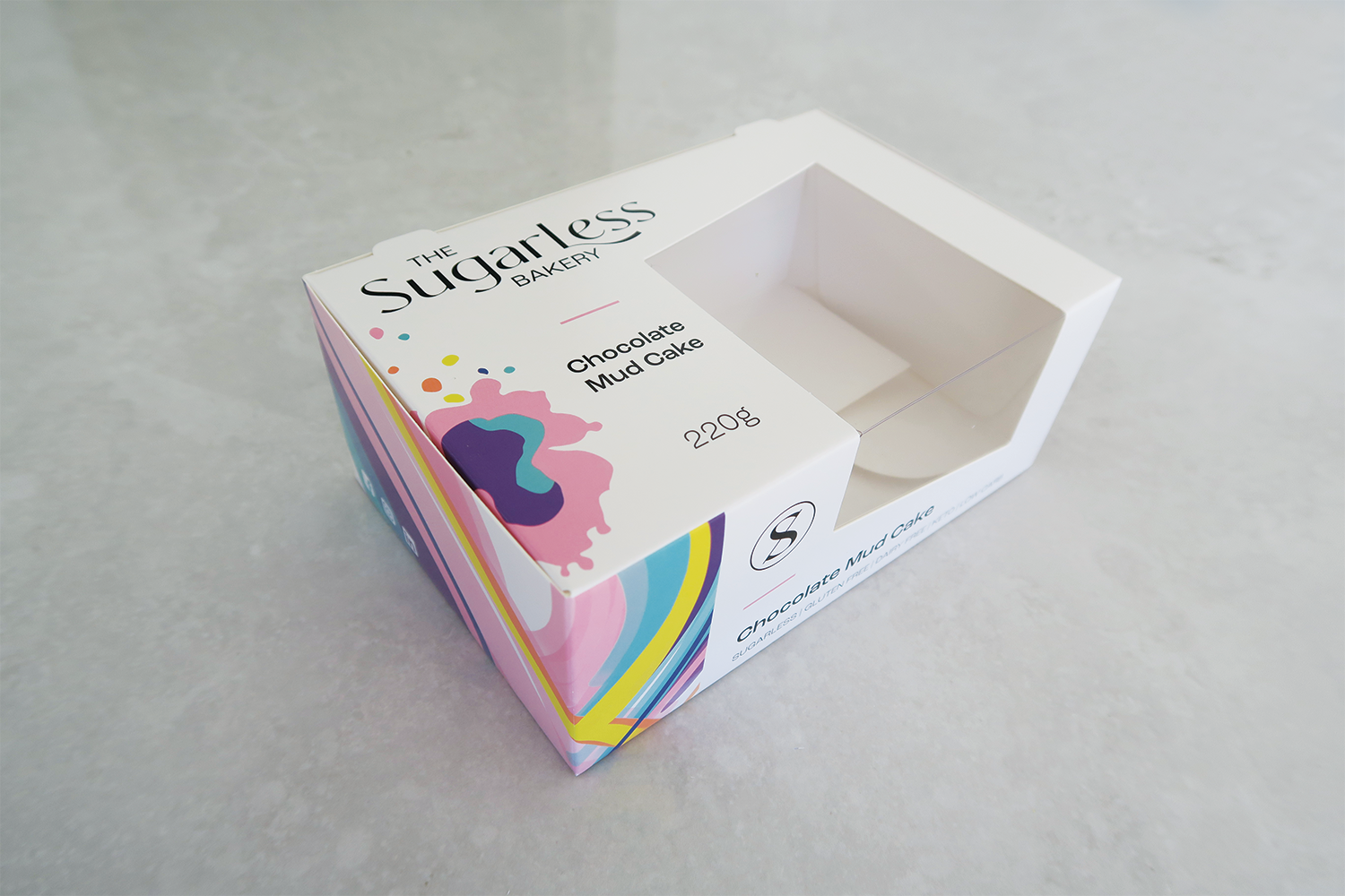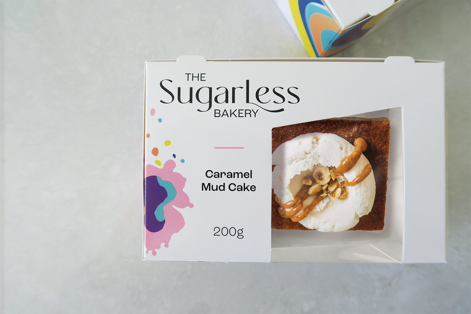
The Sugarless Bakery asked me to refresh the brand and create a new pack for their slices & cakes. The new logo is clear and complimented by hand illustrated artwork that wraps across two panels on the new packs.
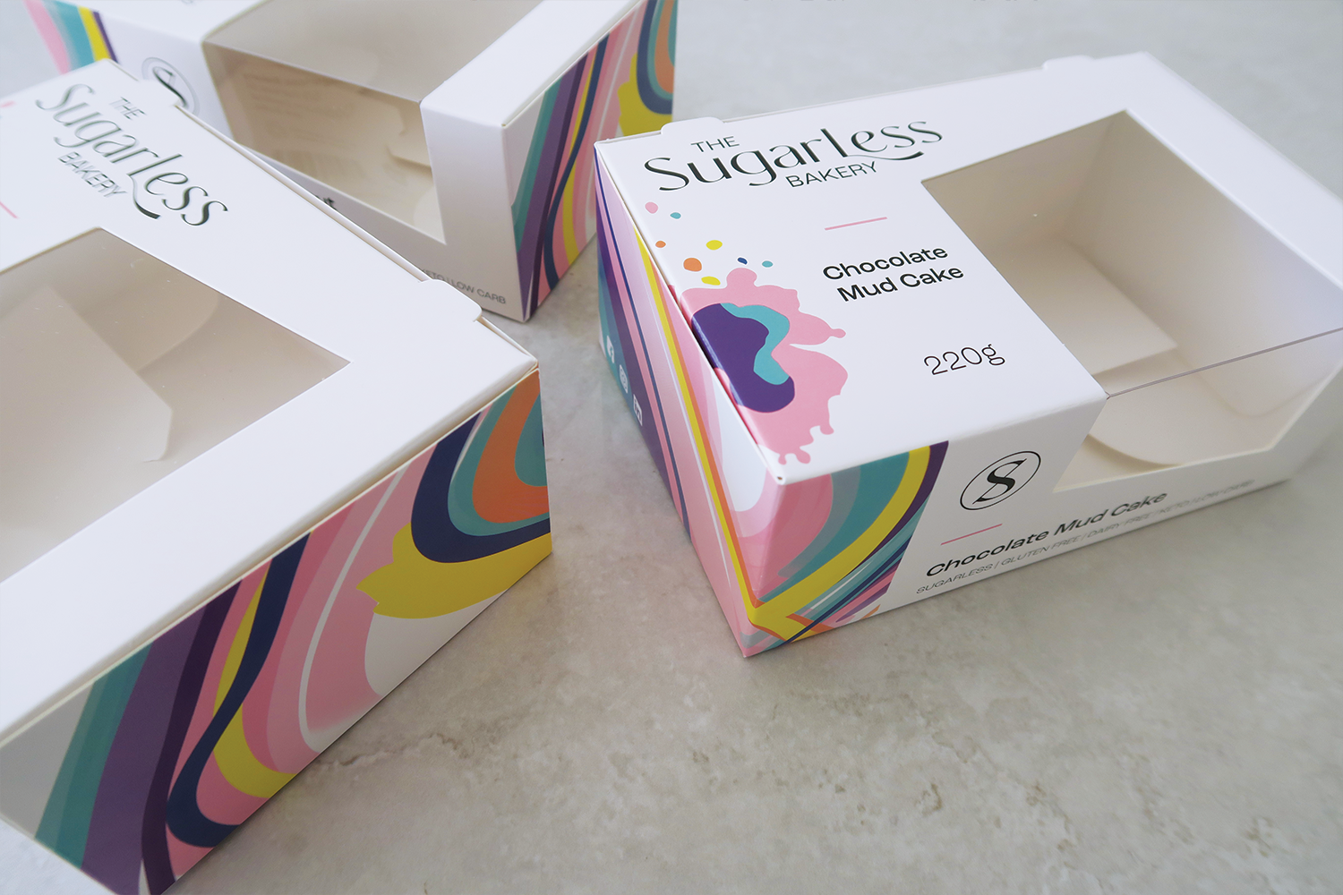
The window is angled to contrast the flowing artwork. Along with the new look and feel, there is an “S” with a strike through to represent sugarless. Each of the components in the new branding can be used independently and as a family. The new packs are paper card with a PET window and are both recyclable.