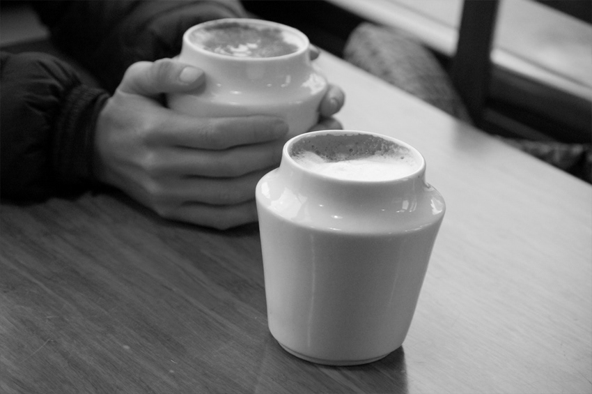
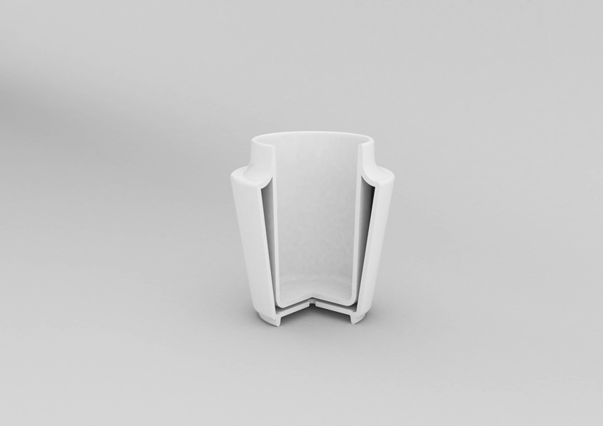
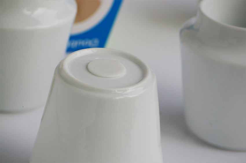
The objective was to design a cup specifically with the hands in mind. Not intending the cup to look like the typical mug/handle style,its form results from the unique rim that is a gentle place for your lips to rest while sipping. The angle stems from the space between the two porcelain walls and production requirements. The tapered wall allows for a comfortable grip. Each cup is high temperature glazed and finished in glossy white.
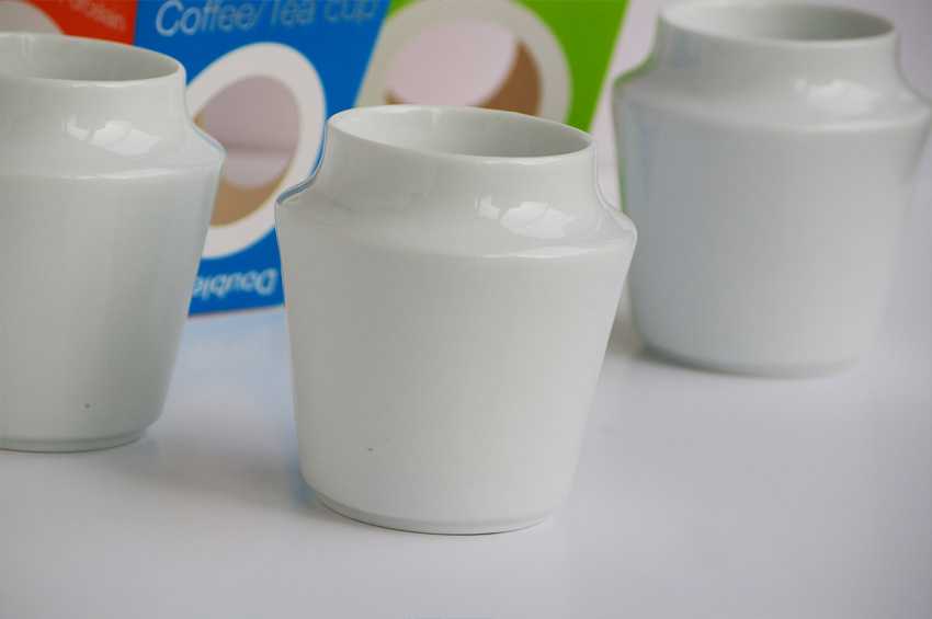
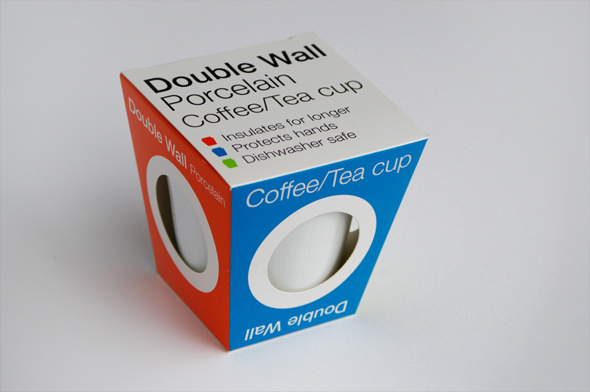
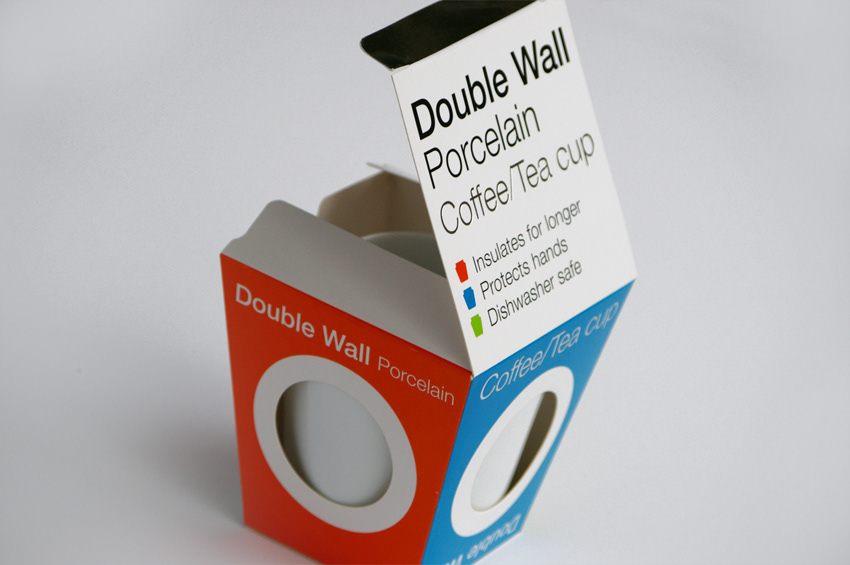
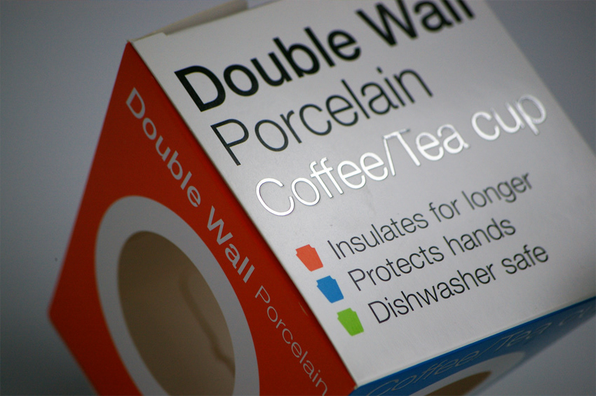
The cup’s package results from being true to the product’s form. Holes in three sides with a white circular boarder around each hole are actually an interpretation of viewing the porcelain cup from above. It was important that the customer also get to see and feel porcelain through the box.
As the cups are plain white, the package serves to attract the eye via panels of color. The pantone colors for the package were selected as if they were intended for the cups, so as to create more relevant feel. The overall trapezoidal shape of the package shares similarity with the classic fast food noodle boxes. This whether a good or bad thing does actually reinforce that the product is food/drink related.
As the cups are plain white, the package serves to attract the eye via panels of color. The pantone colors for the package were selected as if they were intended for the cups, so as to create more relevant feel. The overall trapezoidal shape of the package shares similarity with the classic fast food noodle boxes. This whether a good or bad thing does actually reinforce that the product is food/drink related.